Objective:
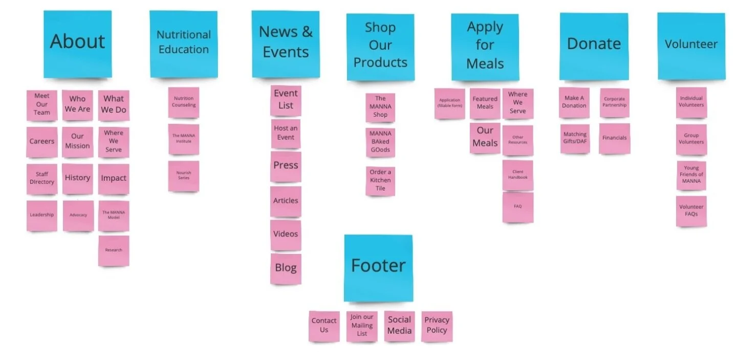
Evaluate and describe the IA of a non-profit’s existing products and services then develop and communicate recommendations for new/redesigned products and services.
Deliverables:
Heuristic Evaluation (Top 3 Issues), Personas, Experience Mapping, Content Inventory Audit, Site and Product Recommendations
MANNA PA
Metropolitan Area Neighborhood Nutrition
In a team of 3, we evaluated the state of MANNA’s website. MANNA provides medically tailored meals and nutritional education to those with illnesses to hopefully improve their condition. It’s important that users understand how to navigate through their website to better efficiently complete their tasks.
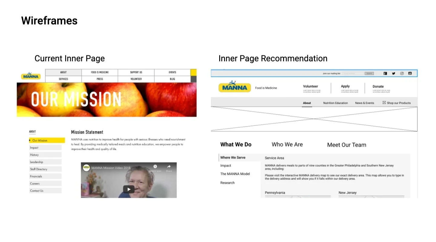
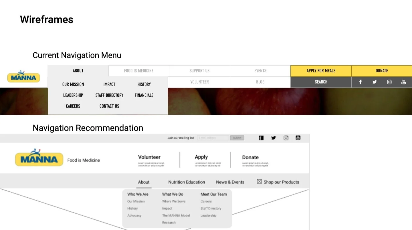
We conducted a heuristic evaluation in order to measure and improve MANNA’s usability issues as well as to identify any problems that are associated with any inner pages of the website. We wanted to highlight the two heuristics that had the most violations and were the most important to MANNA’s users: Accessibility and Clear.
Personas based on the 3 target users: Group Volunteer, Individual Volunteer and Donor. Each panel describes the pain points associated with the corresponding user group along with their website usage based on the action required by them on the website. This is based on our interviews with 1 donor, 4 volunteers, and a stakeholder.
*Unable to speak to patients due to HIPAA
To help establish which content was necessary, we used John McCrory Content Audit Venn Diagram Strategy. We filled in the sections based on our interviews.
*If interested in our digital product recommendation, please contact me, and I can send over the deck!


